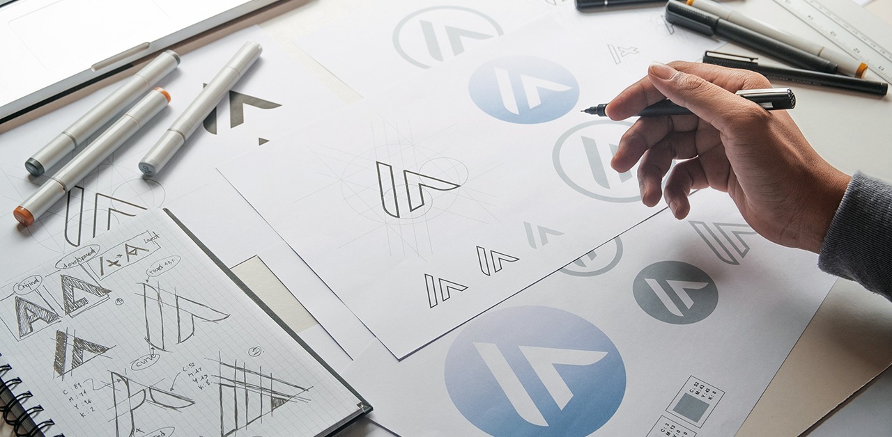
How Often Should You Update or Change Your Logo?
Your logo is the face of your brand—it’s the first impression customers get and a key part of your business identity. But as design trends, customer expectations, and your business evolve, you may start wondering: How often should I update or change my logo?
Signs It’s Time for a Logo Refresh
You don’t need to overhaul your logo every year, but there are certain signs that indicate it’s time for an update:
✅ Your Business Has Grown or Changed – If you’ve expanded your services, changed your target audience, or shifted your brand’s focus, your logo should reflect those updates.
✅ It Looks Outdated – Design trends change, and an outdated logo can make your brand feel stuck in the past. A refresh can modernize your look while maintaining brand recognition.
✅ It’s Not Versatile – If your logo doesn’t work well on social media, mobile screens, or printed materials, it may be time for a redesign that’s more adaptable.
✅ It Doesn’t Reflect Your Brand Identity – If your logo no longer aligns with your business’s mission, values, or aesthetics, a rebrand can help bring everything back into alignment.
How Often Should You Refresh Your Logo?
A minor refresh (small tweaks to fonts, colors, or layout) is recommended every 5-7 years, while a full rebrand (a completely new logo) may be necessary every 10-15 years depending on industry trends and business growth.
Some of the world’s biggest brands, like Starbucks and Apple, have refreshed their logos over time while keeping their core identity intact. The key is to evolve without losing brand recognition.
Many of the world’s most recognizable brands have successfully updated their logos over time, proving that evolution is key to staying relevant. Apple transitioned from a detailed illustration to the sleek, minimalist apple we know today, reflecting its shift toward modern innovation (Apple Logo Evolution). Starbucks has gradually simplified its mermaid logo while maintaining its brand identity, ensuring it remains timeless and iconic (Starbucks Logo History). Pepsi, on the other hand, has undergone multiple redesigns to keep up with changing consumer preferences and trends (Pepsi Logo Evolution). These brands showcase the importance of refining a logo to align with modern aesthetics while preserving brand recognition.
Need a Logo Refresh? Let’s Talk!
If you think your logo might be due for an update, I can help! Whether it’s a subtle refresh or a full rebrand, I’ll create a design that reflects your business and makes a lasting impression. Let’s chat about your brand’s next evolution!


